React Native ile TextInput animasyonu oluşturmak
React Native Animated kütüphanesine basit bir giriş.
Last Update: January 12, 2021
9 min read • ––– views
This post is also available in English
Beş yıl önce react-native-textinput-effects kütüphanesini yayınlamıştım. O zamanlardan bu yana Animated kütüphanesinin kullanım şekli pek değişmedi. Bugün beş yıl önce kullandığım yöntemlerle yeni bir React Native TextInput component'i geliştireceğim ve yaptıklarımı aşama aşama buraya kaydedeceğim.
Bu sefer farklı olarak material-ui animasyonunu oluşturacağım. Oldukça basit bir animasyon olduğu için React Native animasyon konseptlerini anlamak için faydalı olacağını düşünüyorum.
Bu component'in tam halini Github'dan bulabilirsiniz. react-native-web sayesinde bir web demosu da oluşturdum.
Buradan inceleyebilirsiniz 👇
Demodan da görebileceğiniz gibi, oluşturacağımız TextFieldin dört farklı görünümü olacak:
Basit TextField görünümü oluşturmak
React Native içinde bulunan TextInput'tan türeyen basit bir TextField component'i oluşturarak başlayalım.
import React from 'react';import { StyleSheet, TextInput } from 'react-native';// React Native TextInput'un bütün prop'larını destekleyeceğiztype Props = React.ComponentProps<typeof TextInput>;const TextField: React.FC<Props> = (props) => {/*** buradaki spread operatorü(...) style parametresi haricinde** bütün parametreleri `restOfProps` değişkeni** içerisinde kaydetmemiz sağlıyor.** bu şekilde kullanarak bütün TextInput** prop'larını aşağıya iletebiliyoruz.*/const { style, ...restOfProps } = props;return <TextInput style={[style, styles.input]} {...restOfProps} />;};const styles = StyleSheet.create({input: {padding: 24,borderColor: '#B9C4CA',borderWidth: 1,borderRadius: 4,fontFamily: 'Avenir-Medium',fontSize: 16}});export default TextField;
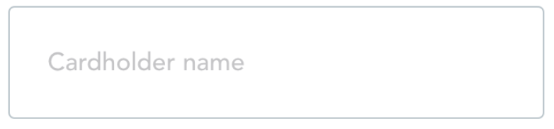
Bu kod çıktı olarak border ve placeholder'a sahip basit bir TextInput yaratıyor.
<TextField placeholder="Cardholder name" />
Label(etiket)'ı oluşturmak
Kullandığımız placeholder değişkeni label olarak bizim için yeterli değil çünkü yalnızca input boş olduğunda görünür halde kalıyor. Bizim istediğimiz label ise input dolu olduğunda kaybolmamalı, input'un hemen üzerinde görünür olmalı.
Label'ı dilediğimiz gibi özelleştirebilmek için placeholder kullanmak yerine kendi yarattığımız bir View kullanmak daha mantıklı. Bu oluşturacağımız View'i position: absolute kullanarak TextInput'un üzerine yerleştirebiliriz.
TextInput içerisinde label adında bir prop olmadığı için bizim component'a özel olarak tanımlamamız gerekiyor. TypeScript'te bu şekilde bir tanımlamayı yapmak için TextInput'u extend etmemiz gerekiyor.
type Props = React.ComponentProps<typeof TextInput>type Props = React.ComponentProps<typeof TextInput> & {label: string}const TextField: React.FC<Props> = (props) => {const { style, ...restOfProps } = propsconst { label, style, ...restOfProps } = propsreturn (<TextInputstyle={[style, styles.input]}{...restOfProps}/><View style={style}><TextInput style={styles.input} {...restOfProps} /><View style={styles.labelContainer}><Text style={styles.label}>{label}</Text></View></View>)}const styles = StyleSheet.create({labelContainer: {position: 'absolute',left: 16,top: -6,paddingHorizontal: 8,backgroundColor: 'white',},label: {fontFamily: 'Avenir-Heavy',fontSize: 12,},
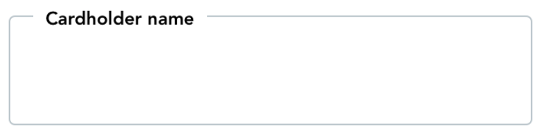
Bu değişiklikten sonra TextField aşağıdaki gibi görünecek:
Label pozisyonunu focus durumuna göre değiştirmek
Şimdi sıra geldi input'un focus durumuna göre label pozisyonunu değiştirmeye. Input focused haldeyken label input'un üzerinde, unfocused haldeyken ise input'un tam ortasında durmalı. İlk adım olarak bir isFocused state'i oluşturup label pozisyonunu buna göre animasyon olmadan değiştirelim.
Bunu yapabilmek için TextInput'un onBlur ve onFocus event'lerini dinlememiz ve oluşturduğumuz isFocused state'ini güncellememiz gerekir. Bunu başardıktan sonra tek yapmamız gereken label'ın top değerini isFocused'a göre değiştirmek olacak. Aynı zamanda focused durumuna göre label'ın renk ve boyutunu da düzenleyeceğiz:
const TextField: React.FC<Props> = (props) => {const {label,style,onBlur,onFocus,...restOfProps} = propsconst [isFocused, setIsFocused] = useState(false)return (<View style={style}><TextInput style={styles.input} {...restOfProps} /><View style={styles.labelContainer}><Text style={styles.label}>{label}</Text><TextInputstyle={styles.input}{...restOfProps}onBlur={(event) => {setIsFocused(false)onBlur?.(event)}}onFocus={(event) => {setIsFocused(true)onFocus?.(event)}}/><Viewstyle={[styles.labelContainer,{top: isFocused ? -6 : 24,},]}><Textstyle={[styles.label,{fontSize: isFocused ? 12 : 16,color: isFocused ? '#080F9C' : '#B9C4CA',},]}>{label}</Text></View></View>
Label animasyonunu oluşturmak
Artık label'ın pozisyonunu focused durumuna göre değiştiriyoruz. Sırada bunu bir animasyon yardımıyla yumuşak bir şekilde yapmak var. Bunun için React Native içerisinde gelen Animated kütüphanesini kullanacağız. Öncelikle, kütüphanenin içerisindeki Animated.Value ile bir değişken yaratacağız. Daha sonra ise bu değeri yorumlayarak(interpolate) label pozisyonuna çevireceğiz.
Animated.Value metodu bir numara değişkeni ile çalışıyor. Bu nedenle isFocused state'ini 0 ve 1 olarak temsil etmemiz gerekli.
const [isFocused, setIsFocused] = useState(false)const focusAnim = useRef(new Animated.Value(0)).current/*** Bu useEffect sayesinde her `isFocused`** değeri değiştiğinde animasyonumuz tetiklenecek.*/useEffect(() => {Animated.timing(focusAnim, {toValue: isFocused ? 1 : 0,// duration ve easing değerlerini// material.io demo sayfasından aldım.duration: 150,easing: Easing.bezier(0.4, 0, 0.2, 1),// bu parametreye daha sonra değineceğizuseNativeDriver: false,}).start()}, [focusAnim, isFocused])return (<View style={style}><View<Animated.Viewstyle={[styles.labelContainer,{top: isFocused ? -6 : 24,top: focusAnim.interpolate({inputRange: [0, 1],outputRange: [24, -6],}),},]}><Text<Animated.Textstyle={[styles.label,{fontSize: isFocused ? 12 : 16,fontSize: focusAnim.interpolate({inputRange: [0, 1],outputRange: [16, 12],}),color: isFocused ? '#080F9C' : '#B9C4CA',},]}>{label}</Text></View></Animated.Text></Animated.View></View>)}
Native driver kullanmak
Son değişikliğimizle birlikte animasyonumuz istediğimiz şekilde çalışır hale geldi. Ancak bu animasyonu özellikle eski telefonlarda daha akıcı bir şekilde çalıştırabilmemiz için yapabileceğimiz bir işlem daha var: useNativeDriver: true seçeneğini kullanmak.
Native driver hakkında React Native dökümantasyonundan daha fazla bilgi alabilirsiniz:
By using the native driver, we send everything about the animation to native before starting the animation, allowing native code to perform the animation on the UI thread without having to go through the bridge on every frame. Once the animation has started, the JS thread can be blocked without affecting the animation.
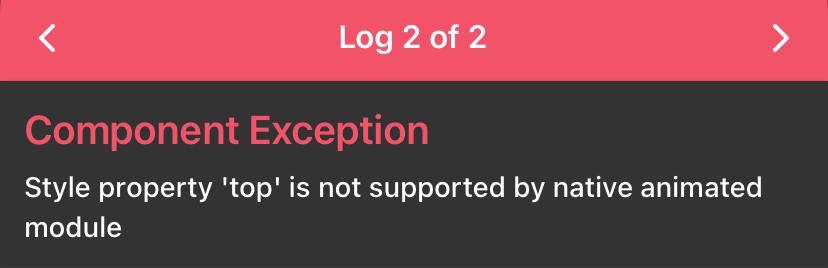
Maalesef native driver ile birlikte kullanabileceğimiz style değişkenleri çok sınırlı. Bizim animasyonumuzda kullandığımız gibi top ve fontSize alanlarını native driver ile kullanmak mümkün değil. Oluşturduğumuz animasyonu useNativeDriver: true ile kullanmak istediğimizde aşağıdaki gibi bir hata veriyor:
Yapmamız gereken top ve fontSize'ı native driver tarafından desteklenecek şekilde değiştirmek. Neyse ki aynı animasyonu transform alanını kullanarak da oluşturabiliriz. fontSize animasyonu yerine transform'un scale alanını, top animasyonu yerine de translateY'yi kullanabiliriz.
style={[styles.labelContainer,{top: focusAnim.interpolate({inputRange: [0, 1],outputRange: [24, -6],}),transform: [{scale: focusAnim.interpolate({inputRange: [0, 1],outputRange: [1, 0.75],}),},{translateY: focusAnim.interpolate({inputRange: [0, 1],outputRange: [24, -12],}),},{// scale maalesef label'ı x ekseninde// hareket ettirdi. bunu tersine çevirebilmek// için translateX kullandım.translateX: focusAnim.interpolate({inputRange: [0, 1],outputRange: [16, 0],}),},],},]}><Animated.Text<Textstyle={[styles.label,{fontSize: focusAnim.interpolate({inputRange: [0, 1],outputRange: [16, 12],}),color: isFocused ? '#080F9C' : '#B9C4CA',},]}>{label}</Animated.Text></Text></Animated.View></View>)
Yukarıdaki düzenlemelerden sonra useNativeDriver: true değişikliği ile native driver kullanmaya başlayabiliriz.
Hata state'ini oluşturmak
Son olarak hata durumunu göstereceğimiz state'i oluşturacağız. Bunun için öncelikle errorText şeklinde yeni bir prop tanımladım. Daha sonra bu prop'un boş/dolu durumlarına göre label'ın rengini ve borderColor'ını güncelledim:
type Props = React.ComponentProps<typeof TextInput> & {label: stringerrorText?: string | null}const TextField: React.FC<Props> = (props) => {const {label,errorText,style,onBlur,onFocus,...restOfProps} = propslet color = isFocused ? '#080F9C' : '#B9C4CA'if (errorText) {color = '#B00020'}return (<View style={style}><TextInputstyle={styles.input}style={[styles.input,{borderColor: color,},]}{...restOfProps}onBlur={(event) => {setIsFocused(false)@@ -72,13 +83,15 @@ const TextField: React.FC<Props> = (props) => {style={[styles.label,{color: isFocused ? '#080F9C' : '#B9C4CA',color,},]}>{label}{errorText ? '*' : ''}</Text></Animated.View>{!!errorText && <Text style={styles.error}>{errorText}</Text>}</View>)}const styles = StyleSheet.create({error: {marginTop: 4,marginLeft: 12,fontSize: 12,color: '#B00020',fontFamily: 'Avenir-Medium',},})
Son dokunuşlar
Son olarak düzeltmemiz gereken birkaç küçük problem kaldı.
İlk problem: Input'a girilen değerler isFocused: false olduğunda kayboluyor. Bunu düzeltmek için input değeri boş olmadığında label'ı tepeye göndermemiz gerekli:
const {label,errorText,value,style,onBlur,onFocus,...restOfProps} = propsconst [isFocused, setIsFocused] = useState(false)const focusAnim = useRef(new Animated.Value(0)).currentuseEffect(() => {Animated.timing(focusAnim, {toValue: isFocused ? 1 : 0,toValue: isFocused || !!value ? 1 : 0,duration: 150,easing: Easing.bezier(0.4, 0, 0.2, 1),useNativeDriver: true,}).start()}, [focusAnim, isFocused])// `value` değişkenini aşağıdaki dependency array'ine// eklemeyi unutmayın. bu sayede `value` her değiştiğinde// label pozisyonu da güncellenebilir.}, [focusAnim, isFocused, value]
İkinci problem ise input'un boş olduğu zamanlarda input üzerindeki label'a tıklayınca gerçekleşiyor. Burada React Native input'un seçildiğini anlamadığı için telefonun klavyesini açmıyor. Bundan dolayı label elementini bir butona çevirmemiz ve bu alana tıklandığında manuel olarak input'a focus olmamız gerekli:
// boş bir ref değeri oluşturalımconst inputRef = useRef<TextInput>(null)// oluşturduğumuz `inputRef`'i TextInput'a atayalım<TextInput ref={inputRef} />// Label'ı `TouchableWithoutFeedback` ile butona çevirelim<TouchableWithoutFeedback onPress={() => inputRef.current?.focus()}>
Sonuç
TextField'in son halini aşağıdaki video'da görebilirsiniz:
Kodun tam halini ise Github'da bulabilirsiniz. Bir sorunuz olursa bana Twitter üzerinden ulaşabilirsiniz.